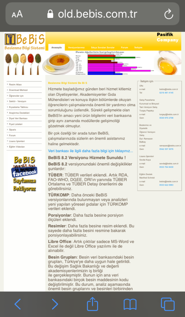
A long term customer had been using custom Perl software with their TYPO3-powered website. Several Perl generated HTML pages were embedded in their TYPO3 website to capture input from forms and generate license numbers and provide access to downloads of their nutrition calculation software for dietitians and health professionals.
The Perl software was not easy to maintain and during our investigation of the data we found problems with the data storage and hacking attempts. While this software automated some processes, there was still significant manual processing required by our client’s admin team and they wanted to change some of these processes and workflow.
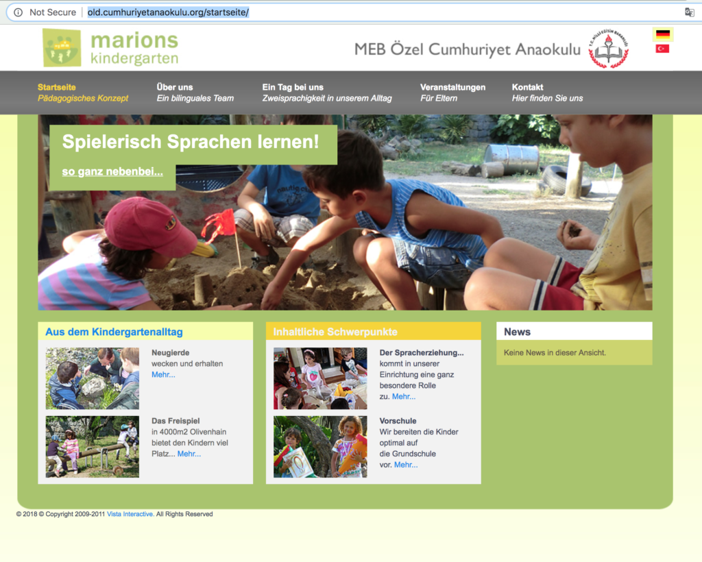
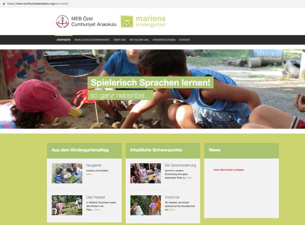
At the same time, their website was using a old version of TYPO3 which was no longer supported and was also difficult to use. The design was not compatible with modern devices and screen sizes.
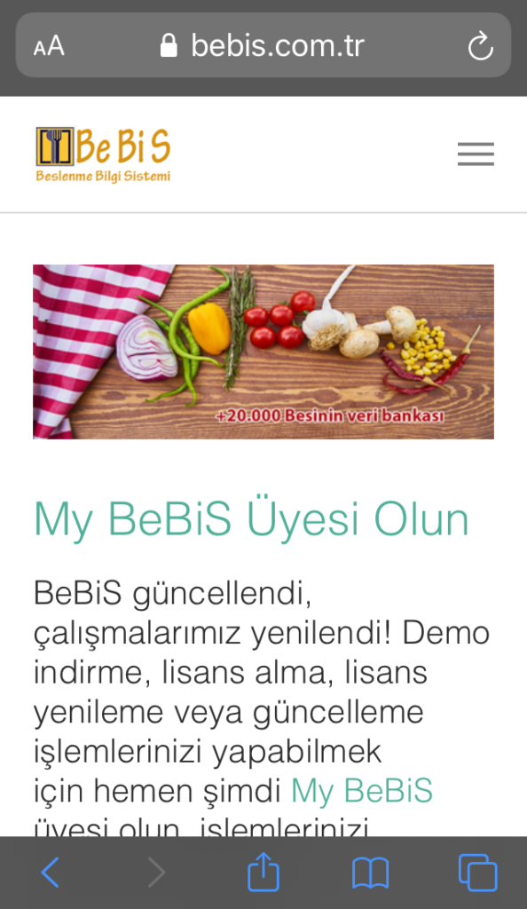
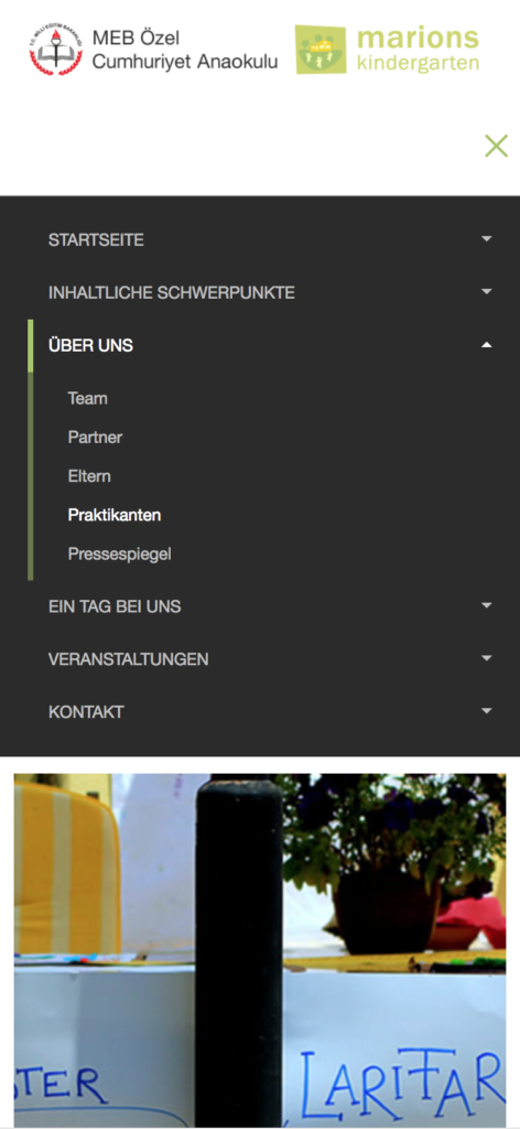
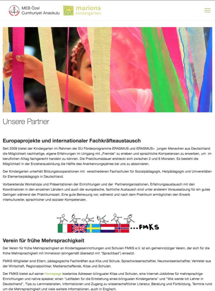
We worked with the client to upgrade their TYPO3 website to the latest version with a responsive design and develop a new user-focussed system for managing licenses and downloads that was fully integrated in TYPO3 with a custom TYPO3 extension .
Upgrade process
Typically when we upgrade a customer’s TYPO3 website, we duplicate their existing site and then apply the upgrades for each newer version of TYPO3, often stepping from 4.5 to 6.2, 7.6, 8.7, and then arriving at the latest release of 9.5. Each upgrade step requires updates to extensions and sometimes design template changes. On sites with many extensions there are sometimes compatibility issues.
In this case, we did not need the previous design and the website was using very few extensions so we could jump directly from version 4.5 to 9.5 by generating an export of only the content from the original website and importing it into a new TYPO3 9.5 installation. The customer needed to review all of their content anyway and so this was a good opportunity to restructure the website and improve on the placement of the content and navigation.
New features
To make the website more useful to our client’s users, the main feature we added was a personalized section of the website using TYPO3’s built-in front end user features. We added a few extensions. One to manage front end users and let them register their own accounts, another to secure downloads and restrict access to specific user groups and another that allows our client to send direct email newsletters to their users.
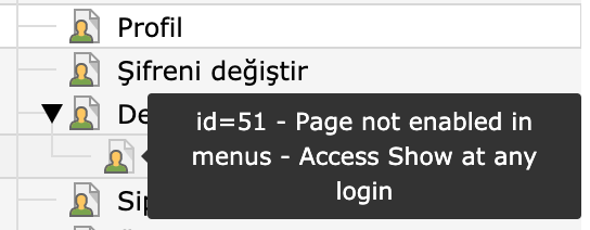
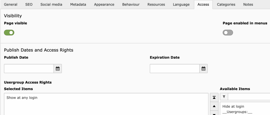
All pages and content in a TYPO3 website can be public or restricted to groups of users and so we were able to customize the content and deliver it to only those who had access. In our case, after registration, new users of the website can download a demo version of the nutrition information system software. If these users then go on to purchase a student or full version of the software then they get access to downloads and content related to that version of the software. Our client can send a custom newsletter to student users inviting them to seminars about using the software or to upgrade to the full version.
Custom extension
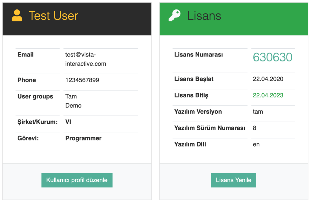
To complete the features for the users to manage their licenses and software downloads, we wrote a custom TYPO3 extension to replace the Perl software and integrate with the TYPO3 front end user features.
The Perl software was storing user and license information in a flat file. A relational database is more useful for storing information and offers better structure and retrieval of data. Therefore our solution uses tables in the TYPO3 database for the website, and we extended existing tables and added a new table for licensing data.
The licensing part of the this extension produces a license number for the user calculated from the software version and a key generated by their installation of the nutrition information system software and stores this in the database.
Data import
Our client had over 12000 existing users of their software and so their data needed to be imported into the TYPO3 database. We first examined the data in a spreadsheet and tidied it to prevent errors, removing duplicate information and invalid dates. [The Perl software had been wrongly generating invalid dates when the license expired 3 years after a leap day.] We could then map the data in the spreadsheet columns to the columns in the TYPO3 database and import the records.
Results
The new, easier-to-use design and the user focussed features have made the website more useful for our client’s customers. This is reflected in the analytics which show that there has been an increase in the number of both new users and returning users to the website and the amount of time these users are spending on the website. Past analytics show that there are busy periods for the website at different times of the year and some of this increase in website traffic can be attributed to our client’s marketing push, but there is a marked increase compared with the same time period last year.

You can view our client’s new version of their website at https://bebis.com.tr.
If you need a TYPO3 upgrade or a custom TYPO3 extension for your website, please contact us.


