Collaborative blogging

In 2007 I created a blog to share mainly with my brothers about any innovation, technology, contraptions or gadgets we found interesting.

Growing up we were always interested in anything mechanical, electronic or sciencey. Our parties usually involved some complicated arrangement of lights, sound and video technology. Living on the opposite side of the world, I wanted to keep in touch with them and their gadgets and so I created the Muzgadgets blog and invited my brothers as authors. Of the almost 300 articles, they have written one or two posts each. I had hoped that they would contribute more.

For any technical support issues we have with Vista Interactive, we also have a support blog. For our customer base in Turkey, I asked a friend to translate any posts into the Turkish version. He did a few, but because our support blog posts are infrequent – only when we have issues – he lost interest and the Turkish version is lagging behind.

Here’s hoping that that Vista Interactive team will collaborate with me and contribute their posts on this Vista Interactive Blogging Experiment.


Changing usernames in WordPress

For security reasons, it is advisable to use different username from the default (admin) and make it more difficult for hackers to attack your blog or website with brute force.

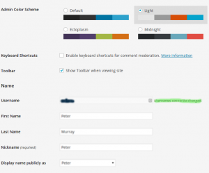
However, changing usernames is not always easy. On the profile editing form for WordPress is a warning that “Usernames cannot be changed”:

WPlies

While it is true you cannot change the username with the profile editing form, it is possible to change it in the database. Contact your systems administrator if you don’t have this level of access and take care – a wrong database entry could break your whole blog or website.

Excellent hosting

A shout out to Media Temple who hosts many of our websites. After a disaster with our server down for several days with a previous low-cost hosting provider, we are glad of Media Temple’s excellent technical support and proud to be affiliated with them since 2008.

(mt) DV
[Referral link]

Why does a TYPO3 developer use WordPress?

Having developed websites with TYPO3 since 2005, why would I want to use WordPress for blogging?

TYPO3 is an enterprise content management system – it should easily handle something as simple as a blog. TYPO3 can, but when you are busy building websites for others it can be a challenge to find the time and resources to build your own things in any technology.

Here’s some reasons for making this in WordPress:

  1. WordPress is popular and simple to use.
  2. WordPress is fast to get blogging. TYPO3 does not yet have many high quality packages that provide the same “minutes out of the box and you can use it experience”.
  3. Many of our customers want WordPress or are already using it. If we use the same tools we can better support them.
  4. Using different tools can create a cross-pollination of ideas. There are many features of TYPO3 and WordPress that could be improved on by learning from other content management systems.
  5. WordPress like TYPO3 is Open Source so I can have full access to fix any problems in the software myself.

Design matters

Good design matters even when you are the only one using it.

A recent upgrade to Parallels Plesk on our main server added a lot of new features and solved some problems for our email users.

The upgrade changed the theme for the control panel and so our previous branding looked ugly with the new design. Even though I am the person who uses the control panel the most often, it was important to update our branding on the control panel to keep it looking professional and avoid the distraction of the ill-fitting logo.

Before:

Our logo in the top left corner had a transparent background.
Previous branding on Plesk detail
A closer view

After Plesk upgrade:

Branding on Plesk detail
With the background color change, the old branding is unreadable and ugly.

After uploading our standard logo:

New logo on Plesk detail
The new logo looks better, but the white background is uncomfortable.

After new branding:

Final branding on Plesk detail
With a transparent background and recoloring the text, the new branding fits much better.

I could have spent more time getting it pixel perfect, but I am pleased with this solution.

As you can see, design is often a process of making things fit for their purpose.

In this case, our design fits these purposes:

  • links this Plesk control panel with the rest of the services we offer
  • instant recognition of who is responsible for the control panel
  • not distracting from the main purpose of the control panel

What irks you about the design of the tools you use? Do you need some help to fix it?